Hayao Miyazaki is critically acclaimed to be one of the best anime writers and directors of all time. He's directed anime films such as My Neighbor Totoro, Howl's Moving Castle and Ponyo. Even though his films seem to be targeted towards children, they're something people of all ages can enjoy and have something to take away from.
Spirited Away is one of his more well known films. Made in 2001, it's a story about a girl named Chihiro who is moving into a new home with her parents. She gets separated from her parents when they take a detour and she accidentally ventures into a different world. The whole point of Chihiro's adventure is to find a way back home. She faces many challenges as she tries to adjust to living in this strange world.
Miyazaki has a very distinct art style that's recognizable in all of his movies. His style tends to be realistic but also very abstract. By realistic, I mean he pays close attention to detail. For example, in a crowded setting in Spirited Away, he does a great job of conveying the confusion and hustle and bustle of a crowded setting through background noise and the constant movement of people in the background.
Spirited Away is an excellent movie, the thought provoking story and unique animation style makes for an entertaining adventure.
Saturday, December 3, 2011
Sunday, November 6, 2011
Anime

The anime I watched is called "Eden of the East." It takes place in the not too distant future in a time when technology and the internet has become a lot more relevant in our daily lives. The story is about a man named Akira Takizawa who lost his memory, he soon learns that he was one of the 12 people in Japan chosen to improve the state of the world. Each of these 12 people were chosen by a man named "Mr. Outside" and they were given the title of "selecao" and a cell phone with 8.2 billion Yen to spend in whatever way they see fit as long as whatever they spend it on is for the greater good of the world.
Our dependency on technology is a major theme of this anime. Characters are constantly on their cell phones because in the time the anime takes place cell phones have the capability to do almost anything a computer can. A nifty animation technique I noticed is when the anime is showing what the character is looking at on the cell phone, the viewer can only see the screen and not the hand of the person holding it. Whenever a button is pressed, the cell phone moves down and back up.
There is also a lot of panning in this anime. When a new setting is introduced, the animators tend to show the viewer an overview of what the setting is like with a wide shot that pans from left to right or vice versa.
Japanese animes tend to go for a more realistic look than American cartoons do. I've noticed in many animes the outlines on characters and settings are drawn with thin lines. Most Japanese animators like to use thin lines because it allows them to add more detail. Animations with thick outlines look more unrealistic because in real life, there are no outlines around people, outlines are only used in cartoons so that people can distinguish objects or characters amongst the background.
Another good animation technique I noticed in Eden of the East is what happens to a character's eyes when they're shocked or angry. Their eyes will become blank white circles with messy outlines. I find this one interesting because I haven't seen anything like it before in other animes, in most other animes when someone is shocked or angry, their eye pupils will just get smaller.

Sunday, October 30, 2011
Banners
I looked at the Bacardi and Corona banners, the both of them required some interaction from the user. The Bacardi ad had an interactive guitar and the Corona ad displayed a bottle underwater and prompted the user to grab it. When the user tries to grab the bottle, the mouse pointer is then taken away by multiple sea creatures.
Interactive ads such as these seem to be the most successful, granted I don't pay attention to any banner when I'm on a website, but of the banners I observed on Bannerblog, I payed the most attention to the interactive ones. There were a few simple banners that had a simple animation of a moving image, and those required no user interaction. In fact, I forgot what most of those banners were about because they were boring. With the interactive banners, it's like playing with a fun iPhone or Android app, it gets the user to actually look more closely at the advertisement since it's like a game for them. If I was to make a banner as a advertisement, I'd want to have some level of user interaction, such as the guitar strings in the Bacardi ad.
Interactive ads such as these seem to be the most successful, granted I don't pay attention to any banner when I'm on a website, but of the banners I observed on Bannerblog, I payed the most attention to the interactive ones. There were a few simple banners that had a simple animation of a moving image, and those required no user interaction. In fact, I forgot what most of those banners were about because they were boring. With the interactive banners, it's like playing with a fun iPhone or Android app, it gets the user to actually look more closely at the advertisement since it's like a game for them. If I was to make a banner as a advertisement, I'd want to have some level of user interaction, such as the guitar strings in the Bacardi ad.
Friday, October 7, 2011
Poetry
http://www.pbs.org/wgbh/poetryeverywhere/uwm/hirsch.html
The first animation that I watched was based on the poem "Branch Library" by Edward Hirsch. This one I really liked because of the smooth and professional looking animation. I really liked how the "long-beaked" boy was made out too look like a bird because of his long nose. His long sleeves were turned into wings and he really looked like a bird from a distance.
One of the techniques from this animation that I'd probably use is horizontal panning. As the boy was flying through the library from left to right, we saw the background moving from right to left. What I would do when showing a moving object is that I would have the object be stationary in the center of the screen while the background is really what's moving. This would give the viewer the illusion of movement.
http://www.pbs.org/wgbh/poetryeverywhere/uwm/wilbur.html
The second animation I watched was based on "Some Words Inside of Words" by Richard Wilbur. What I liked most about this animation was how the words of the poem were constantly displayed and then animated in a certain way that made some letters become detached from others, and then rejoin a different word a few seconds later to finish the poem.
From this animation, I would again use the same panning technique. But in this animation at one point there was a landscape in the background that was faded out a little bit. This made the background seem further away and focused the attention on the characters in the foreground that were brighter. This is a useful technique I'd like to use to make it obvious what the focus of my animation is.
Sunday, September 25, 2011
The Cat Came Back

The animation “The Cat Came Back” opens with a shot of a house on top of a hill at night. Everything is a silhouette until the sun comes up and the animation transitions from night to day. It’s a great transition and great use of colors by showing the black outline of a house.
In general, things are easier to animate when it’s dark. For example one scene takes place in a dark cave and the only things you can see in the animation at this point are the characters eyes. That’s a classic method of animation used by many, but it’s very effective when the animation is trying to be comical and is probably the most effective way of showing the viewer that it’s too dark for any of the characters to see.
Throughout the animation, there are many different dynamic transitions, such as when the man finds the cat and then picks up the basket and turns around holding the basket close to the camera. As the basket moves across the screen, it reveals the next scene in transition. As the basket is moving across the screen from left to right, on the right side of the screen you see the last scene, and when the basket has completely covered the screen it reveals the next scene on the left side of the screen. These dynamic types of transitions aren’t entirely necessary and important to the plot, but they grab the viewer’s attention.
In every scene of the animation, there’s a recurring song that tells the story of the cat returning to the man’s house. The lyrics are always the same and start with “And the cat came back the very next day.” This repetition of the song is representative of the man’s frustration with how the cat constantly returns every day to ruin his house. The repetition of his issues with the cat is put into song. Having the song play over and over again in each scene is an effective way to communicate, to the viewer, this repetition.
The pallet of colors used in the animation seems to be very traditional and very simple. It’s a very colorful animation with blue water, green grass and blue skies. But the color and textures are very simple. Being a colorful and simple-looking animation, that gives the animation a good, light-hearted feel. That’s effective for this animation because it’s supposed to be humorous. The shaky outlines of the characters also add to this feel because, even though it is very well animated, the shaky lines also make it feel as if it was animated by amateurs. But with outlines that were so inconsistent, the animators have to have known what they were doing.
In scene where the man is trying to take a cat far away from his house, the animator often tries to show the viewer how far away the man is going to get rid of the cat. In one scene we see the house way far off in the distance as the man drives the cat away. By keeping the house far in the distance and small, the view can understand how desperate this man is to get rid of that cat. We see exactly the distance he’s willing to travel to get rid of it. In some scenes we see the man go from small to big as he gets closer to the camera, or from big to small as he runs away from the camera.
Saturday, September 17, 2011
OMG I can't draw

But because I'm given the proper tools from image editing programs such as Adobe Flash, Adobe Photoshop and Adobe Illustrator, I have the ability to create professional looking illustrations.
In order to make your flash animation look appealing, you don't have to own a drawing tablet for your computer and be a talented drawer. You don't even need to put a lot of effort into tweaking and refining every detail of your picture in Adobe Illustrator or Photoshop. The animations "These are the Boring Bits" and "Talk to me" show us that complex and detailed animations aren't necessary in order to make an animation seem appealing.
Adobe Flash makes simple animation very easy with motion tweens. When animating a moving object, rather than requiring you to go through each frame of animation and then move the object to the next position, Adobe can do that for you with motion tweens. All you have to do is put the object in its starting position in the first frame, and then to its ending position in the last frame. It makes simple animation possible for anyone who isn't good at drawing.
It doesn't matter so much how simple or complex the animation is, as long as it tells a comprehensible story that is told primarily through the animation. The animation simply has to make sense in relation to the sound in the animation and the dialogue. (If there is any.)
In the animation "The Boring Bits," the characters in the story were only drawings of people's faces and their hair. The animators displayed the bare minimum of their characters on screen. Nothing extra was added to the characters unless it was necessary for the plot to advance, such as one scene where someone was talking on the phone. The only things drawn were the face, the hair and the phone next to the man's face. The background as well was very bland and minimalistic, the only objects on screen were objects that were relevant to the plot.
Thursday, September 1, 2011
This Land by Gregg & Evan Spiridellis
http://www.youtube.com/watch?v=z8Q-sRdV7SY&feature=player_embedded#!
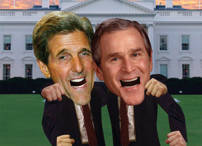
This land is an animation on JibJab.com that was made around the time of the 2004 Election between George W. Bush and John Kerry. This is an animation of the two presidential candidates having a debate but singing while doing so. They go back and forth in each verse singing arguments and counter-arguments to each other in ways that are humorous.
The art style is very original, it has a funny-looking pop art style that uses actual pictures of the two President's and their cabinet members. Their heads are proportionally too big for their bodies, and the way their mouths move almost makes them look like puppets because the jaw simply drops as the rest of their face remains the same. This gives the animation a goofy and lighthearted theme because it looks like the animators didn't put much work into making the characters look realistic, but they did that on purpose.
The best part about the sound in the flash animation is the fact that the music is their own original creation. It is a spoof of an already existing song, but the creators of the flash animation wrote their own lyrics and composed the music themselves from scratch. The creativity behind the lyrics is impressive, the lyrics are semi-informative about the 2004 election, but mostly humorous because it points out the flaws and quirks of both candidates.
Another great aspect of this animation is that the creators showed absolutely no bias, they weren't trying to make one candidate look superior to the other, they were only pointing out the flaws of both candidates, and some strengths.
And at the end of the whole animation, they show Bush and Kerry getting along and singing "This land belongs to you and me." This shows the animators lack of bias because it's trying to show the viewers that it's more fun to get along. Showing the two opposing candidates getting along makes the animation a "feel-good" animation. Rather than making one candidate look bad like a lot of people like to do, they made fun of both candidates.
Subscribe to:
Posts (Atom)